Elm City Market

Brand Identity • Environmental Graphics

The logo for Elm City Market

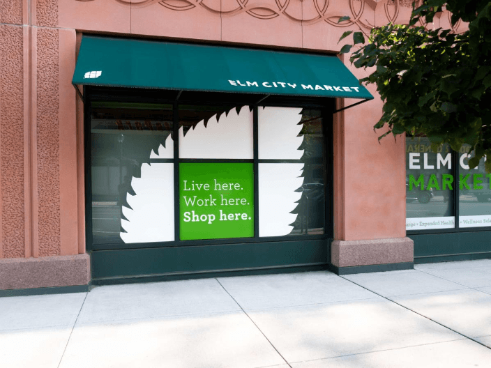
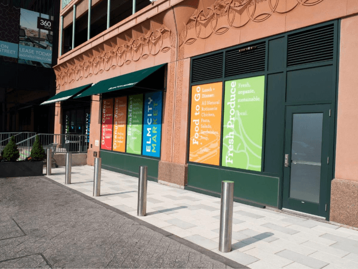
The Elm City Market is a local grocer in New Haven, CT. Alongside a team of three, I designed their logo, exterior signage, apparel, and the retail graphics for their 10,000 square-foot space.

The logo is a combination of a recognizable New Haven symbol — the elm leaf — and a three-by-three grid to highlight the Ninth Square Historic District, where the market resided.

The root
of the issue

Customers reported that the store felt "too premium." The ceiling was painted black and the lighting felt intimate, contributing to the feeling of paying too much for their groceries despite the low prices and high value the Market prided themselves on.

The root of the issue

Customers reported that the store felt "too premium." The ceiling was painted black and the lighting felt intimate, contributing to the feeling of paying too much for their groceries despite the low prices and high value the Market prided themselves on.

The root
of the issue

Customers reported that the store felt "too premium." The ceiling was painted black and the lighting felt intimate, contributing to the feeling of paying too much for their groceries despite the low prices and high value the Market prided themselves on.

Lightening up

The strategy was simple: add light and color. We replaced black with white and used a vibrant color palette to guide customers through the store.
The
bottom line

Creating a brand using a vibrant, fresh color palette and smart wayfinding led to a new perception from the Market's customers. Even though prices stayed stable, the store felt less exclusive and luxury. Aligning the brand's look with their mission of bringing more value to the neighborhood made real impact.

Back

Thanks for visiting!

Email

Resume

Thanks
for visiting!

Email

Resume

Thanks for visiting!

Email

Resume