VCA Animal Hospitals
UX/UI Design

I've taken care of more than a dozen cats throughout my life. Keeping up with their records, long-term health, and the occasional urgent visit can be a challenge.
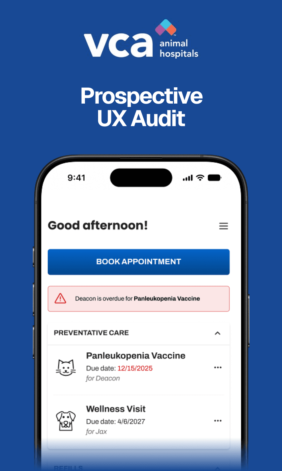
After a confusing experience using the VCA app for my two cats, I performed a UX Audit of their dashboard.
Note: This work is prospective, not shipped work for VCA Animal Hospitals.
The root
of the issue
The user should never have to stop to figure out what they're reading or tapping. A few small mis-steps have made an outsized issue with interface comprehension, which are compounded when the user needs to know something immediately.
Before

Visual inconsistency
The first thing to tackle was inconsistent styling, including:
A busy and misaligned header. The menu icon stacks on top of the greeting, and there are mystery icons on the right.
Multiple icon styles. Some are filled, some are line art.
Unclear or inappropriate emphasis. The red text is a warning, but easy to miss. "Chat with a Medical Expert" is de-emphasized to the point of being a background element.
UX implications
To improve the experience, several issues stood out:
Hidden calls-to-action (CTA) . The first "Book Appointment" button is hidden within a twirl-down section. The second is below the fold.
Confusing text information. Under "Dosing Reminders", the user needs to translate medical jargon to correctly administer medications. This has real-world implications to your pets!
Navigation icons aren't recognizable. Users have to tap icons as a guess to discover where they lead.
After
Visual inconsistency
I resolved all the issues identified with a focus on eliminating unnecessary elements:
An organized and unobtrusive header. The menu icon is aligned and greeting is clear.
One icon style with clarity. From functional icons to expressive ones, the monoline style clearly shows what is depicted and properly communicates its purpose.
Warning text gets a matching text box. Whenever a warning text appears, a box also appears at the top by the CTA to give context.
UX implications
To improve the experience, several issues stood out:
Proper CTA hierarchy. The "Book Appointment" button lives at the top near any warning text. "Remind me" is given a better secondary style and placed alongside the relevant information. "Chat with a Medical Expert" is given a tertiary style and clearly separated from the other section.
Clarified text information. Dosing reminders lead with the medication, not the date and time of the dose. Subsequent text is organized to be readable without jargon.
Clear navigation icons. Pet profiles use a paw icon instead of the "cat/dog silhouette," which is a common veterinary logo. "Guides" is still a brochure icon, but made more recognizable.

The
bottom line
The user experience can be greatly improved with a few intentional and fundamental tweaks. The changes I made could be done with minimal cost, using existing elements, and implemented quickly.
Back